Optimalizácia konverzií prípadová štúdia
IQs Digital’s client was a startup that created a tokenized real investment estate platform where anybody can access a global pool of real estate investment opportunities and start investing in real estate.
When we started working with the client they have just launched their platform, and they were a new player on the market looking for new users.
Start of the marketing strategy
It was a complex project, we helped a client define the go-to-market strategy. We helped our client with identifying the target audiences and planning the whole digital marketing strategy. Then we also helped our client execute the plan we came up working closely together.
User journey
In the initial analysis, we outline a basic user journey, and it came out like this:
- We want to make great PPC campaigns that will drive traffic to the website.
- We want to optimize the user experience on the website and make sure users register on the platform.
- Make sure users who register on the platform invest in one of the opportunities.

Conversion rate tracking
Before we published the marketing campaigns. We worked together with the platform development team on integrating appropriate metrics so we can track users through the whole user journey from first getting in contact with the website to making an investment in the platform.
We integrated conversion rate analytics with Google Tag Manager and Google Analytics. Then we used Google Data Studio to display the stats for every step of the process.
Optimizing digital marketing campaigns
Once we had all the conversion metrics in place we published the marketing campaigns. The first week is always demanding, in this period our team focuses on closely monitoring the ad performance and readjusting the campaigns.
To optimize further our digital marketing campaigns we test a variety of copies, graphics, target audiences, channels, etc. And the optimization process never ends.
A/B testing the landing pages
As soon as we are happy with the clicks, cost-per-click, and ROI from PPC campaigns we direct most of our attention to turning traffic into customers.
In this case, we had in place well performing ads that were driving the traffic to the website, but we wanted to help the client get the most out of a dollar spent on PPC. This is where we focus on A/B testing.
To further boost the conversation rate optimization we created at least two variations of each landing page that received traffic from PPC ads.

Each landing page we were testing differed from others by heading’s copy, text copy, visuals, call to action buttons, conversion forms, content hierarchy, above the fold content, and type social proof.
Of course, the main metric we focused on for the landing pages was the conversion rate but we also took into consideration many other parameters like engagement rate, heat map analysis, user behavior recordings, session duration, and exit point when deciding which version was the best performing.
Analyzing the conversion process
By optimizing landing pages we increased the number of users that wanted to register on the platform.
Since client solutions is a regulated investment platform we needed to meet the legal requirements. Users had to upload their bank statements before making an investment.
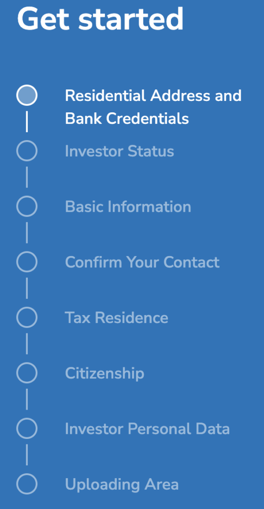
Problem was that the first step in the registration process was the bank statement upload. Users were not so keen to share their bank statements on the platform they just want to register and explore.
The second problem with the registration process was that it had 9 steps. See the screenshot below:

Registration process optimization
Down below is the registration process funnel graph. On top of that, the graph below shows that out of 47 users that started the registration process 4 users finished the whole process and 43 dropped off.

UX fix for the registration process
We helped the client to split the registration process into two parts.
The first part required users to leave only a few absolutely necessary pieces of information like email and password and left the rest for later.
So, instead of asking users for too much information before they can see what the actual platform has to offer, we moved the legally required fields to a later stage in the user journey, that being when the user is ready to invest and already made their decision.
This resulted in increasing the conversion rate by 475%.
